All hazard zones depicted on hazard maps have associated uncertainty, and some maps try to depict this uncertainty visually through a variety of means . The degree of hazard does not suddenly fall to zero when crossing the boundary of a hazard zone, and the degree of hazard is not necessarily the same at every location within a hazard zone.
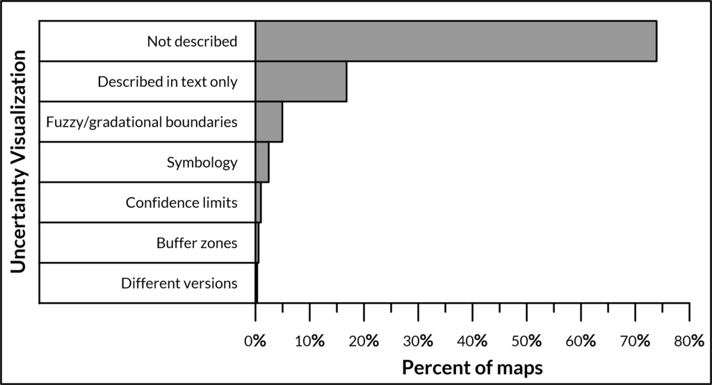
However, uncertainty is notoriously difficult to depict visually on maps without creating confusion. Most hazard maps in the database (74%, Figure 1) do not describe or depict uncertainty about hazard zones in any way. Some hazard maps may either describe uncertainty in the text (17%; full list from the database here) or visually depict (9%) uncertainty about the size, shape, or boundary of hazard zones.
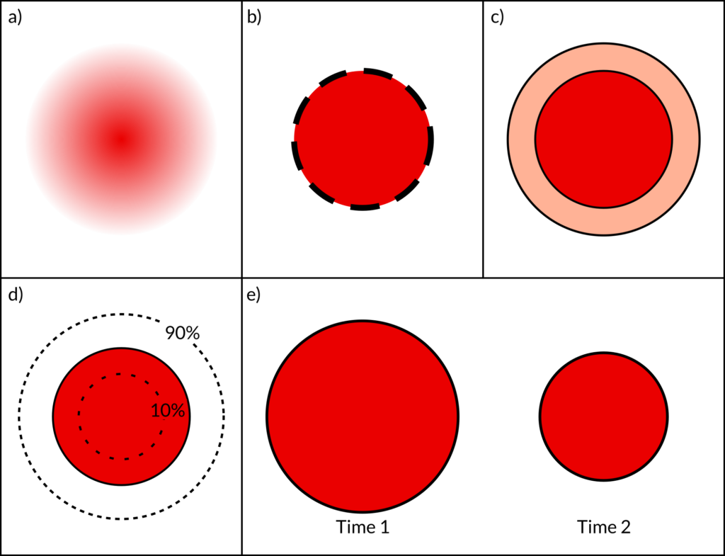
Those that do visually depict uncertainty do so in a variety of ways. Some maps (5% of maps in the database; Figure 2a) use fuzzy boundaries or gradational colors to to show that the hazard does not fall to zero abruptly at the boundary of the hazard zone or change abruptly between hazard zones, but rather gradually declines or changes (a full list of these maps from the database can be found here).
Some maps (2%) use different line symbology (Figure 2b) to indicate hazard zone boundaries that are more or less certain than others (a full list of these maps from the database can be found here).
Others (<1%) depict buffer zones (Figure 2c) around hazard zones to indicate that the actual hazard zone boundary lies somewhere within the buffer (a full list of these maps can be found here).
Some maps (<1%) show confidence bounds (Figure 2d), such as the 10 and 90% confidence limits, around a hazard zone; or show multiple hazard zones representing these upper and lower confidence bounds. A full list of these maps can be found here.
A few maps (<1%) show different versions of the same hazard zone on different map insets in order to convey uncertainty (Figure 2e); especially how the uncertainty in hazard zone size might evolve through a future volcanic crisis. For example, multiple map panels may show different size hazard zones around a hypothetical vent opening location to illustrate decreasing uncertainty as a crisis evolves. A full list of these maps can be found here.