Volcanic hazard maps which show the same hazard, use the same methodology, and serve the same purpose may be visually very distinct due to the wide range of map design choices and cartographic elements included or omitted. Map design plays a huge role in how successful a map is in communicating to the user.
Jump to: color schemes, basemap types, dimensionality or view type, layout, or cartographic elements.
Color Schemes
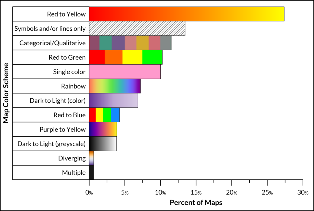
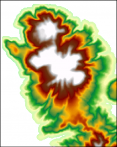
Volcanic hazard maps use a variety of color schemes to differentiate hazard zones (Figure 1). Color has a major influence on a user’s perception of a hazard map (Thompson et al. 2018), and can help quickly guide a user toward a correct interpretation (Wolgalter et al., 1997; Wolfe & Horowitz 2004; interaction-design.org) or cause miscommunications when used without careful consideration (Monmonier 1996; Haynes, et al. 2007; Thompson et al. 2015). For general information on color science and definitions, the NASA Ames Color Research Lab has a variety of resources.
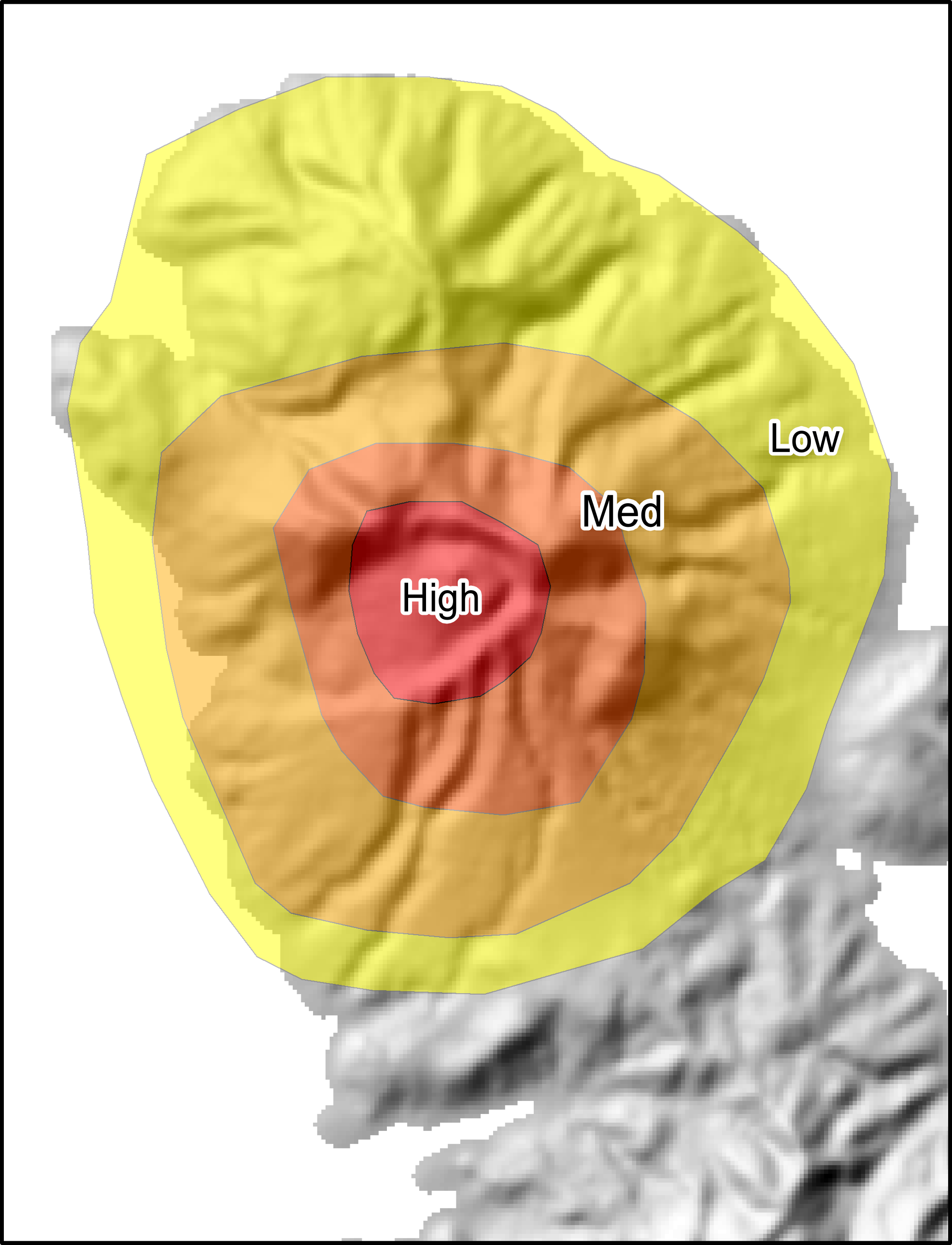
The choice of color scheme is largely dependent on how hazard zones are presented on the map and how hazard zones are defined. For example, for hazard maps showing sequential high-to-low hazard levels like those grouped by hazard level, sequentially ordered color schemes, such as red-to-yellow or dark-to-light, are best for communicating the relative hazard level (Bostrom et al. 2008; Brewer 2006; Thompson et al. 2015). However, for unordered, categorical zones, like those displayed on hazard maps separated by hazard process type (e.g. lahar hazard zone, tephra hazard zone), color schemes that use easily distinguishable, non-ordered, categorical colors with a clear legend are more appropriate (Brewer 2015).
Red-to-green
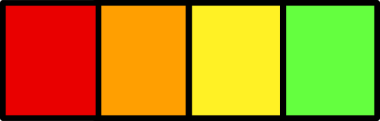
The logical ordering of sequential red-to-green “stoplight” color schemes (red means danger, orange means warning, yellow means caution, and green mean safe) is fairly universal among cultures (Bartels and van Beurden, 1998; Bostrom et al. 2008; Wolgalter et al., 1997) and is used globally for security warnings and traffic lights. This makes red-to-green color schemes easily understood for relative hazard levels. Roughly 10% of maps in the database use a red-to-green color scheme (Figure 1). About 4% of maps use a similar red-to-blue color scheme.
However, red-to-green color scales may incorrectly imply that green zones are ‘safe’ rather than just the lowest hazard zone (Monmonier 2018). Additionally, red-to-green color schemes can pose issues for the color-blind because the highest hazard zone (red) is not distinguishable from the lowest hazard zone (green) in individuals with red-green color-blindness (Jenny & Kelso 2007).
Examples of maps using red-to-green color schemes include: St. Catherine, Grenada (2005) and Tenerife, Spain (2007).
A full list of hazard maps in the database using red-to-green color schemes can be found here.
Red-to-yellow

Most commonly (27% of maps), volcanic hazard maps use sequential red-to-yellow color schemes (Figure 1). Studies of map comprehension have shown that this color scheme has several advantages (Thompson et al. 2015): like red-to-green color schemes, people are able to quickly order hazard zones from highest to lowest hazard; however no zones are misinterpreted to be ‘safe zones’ (as is the case when using the color green), and it is more easily decipherable by people with color-blindness. About 4% of maps use a similar purple-to-yellow color scheme.
Examples of maps using red-to-yellow color schemes include: Isluga, Chile (2013); Purace, Colombia (2014); and Tutupaca, Peru (2018).
A full list of maps using red-to-yellow color schemes can be found here.
Dark-to-light (color or greyscale)
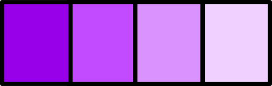
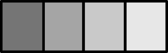
Dark-to-light sequential color schemes are also well-suited for conveying the relative degree of hazard for different hazard zones (Bartels and van Beurden, 1998), and are most effective when the darkest or most saturated hue represents high hazard (Brewer 2006; Bostrom et al. 2008). Dark-to-light color schemes are also appropriate for the color-blind. About 11% of maps in the database use some form of a dark-to-light color scheme (Figure 1). Dark-to-light color schemes include greyscale color schemes or those using different values or saturation levels of a single hue.
Examples of maps using a dark-to-light color scheme in greyscale include: Acatenango, Guatemala (2001); Holuhraun, Iceland (2014); and Baker, USA (1995)
Examples of maps using a dark-to-light color scheme in color include: Tungurahua, Ecuador (2008); Kanlaon, Philippines (2016); and Atitlán, Guatemala (2005).
A full list of maps using dark-to-light color schemes can be found here, with those using greyscale here, and those using color here.
Categorical or Qualitative

With the exception of red-to-green and dark-to-light color scales, other colors do not have a logical ordering to the human brain (Bartels and van Beurden, 1998; Monmonier 2018). Because of this, sequential hazard levels are more difficult to discern on maps using categorical or qualitative color schemes, as the map reader must closely study the map legend to order the zones.
However, carefully selected categorical colors that are easily distinguishable may be appropriate for maps displaying non-ordered, qualitative, or categorical data (Brewer 2015), as is the case with maps with separate zones for each hazard process where the zones are defined primarily by hazard process type rather than by relative hazard level. About 12% of the hazard maps in the database use categorical/qualitative color schemes (Figure 1).
Examples of maps using categorical/qualitative color schemes include: Iwatesan, Japan (1998); Colima, Mexico (2003); and Baker, USA (1995).
A full list of maps using categorical/qualitative color schemes can be found here.
Single color
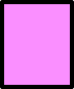
About 10% of maps in the database use only a single color or hue (Figure 1), often for a single access or danger zone, when only a single hazard process is displayed on a separated hazard map, or when a small island is completely covered by one hazard level. Single color maps are often easy to understand, but care must be taken to choose colors that that won’t be mistaken for other cartographic elements (e.g. blue colors may be misinterpreted as water features).
Examples of maps using single color schemes include: Ambae, Vanuatu; Mayon, Philippines (2018); and Saba, Saba [Netherlands] (2005).
A full list of maps using single color schemes can be found here.
Rainbow
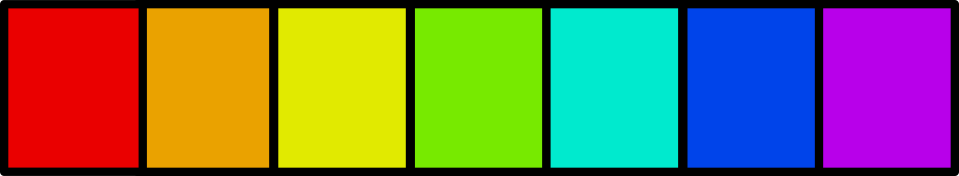
Rainbow color schemes are visually appealing (Brewer 2006) and commonly used for continuous data, such as numerical probabilities, velocities, thicknesses, loading, etc. Many software packages use a rainbow color map as the default color scheme, perhaps accounting for the prevalence of this color scheme in scientific journal articles. About 7% of the hazard maps in the database use rainbow color schemes (Figure 1).
However, rainbow color schemes have several issues concerning visual perception. First, despite a general familiarity with the rainbow color scheme, it can be difficult to perceptually order the colors, it is difficult for the color-blind to distinguish, and it can introduce features that do not actually exist in the data because of the sharp boundaries caused by the scheme itself (Eddins, 2014). Several campaigns (Light & Bartlein, 2004; The End of the Rainbow) have begun to urge editors of scientific journals to disallow rainbow color schemes for figures for these reasons. In fact, Mathworks changed the default color scheme of the popular Matlab software package from a rainbow color scheme to a blue-to-yellow scheme because of these issues.
Some examples of maps using rainbow color schemes include: Rainier, USA (2003); Vesuvius, Italy (2016); and Soufrière Hills, Montserrat [UK] (2009).
A full list of maps using rainbow color schemes can be found here.
Diverging
Diverging color schemes are used for data that have a middle value that is special in some way, e.g. elevation data with sea level as the special value (Brewer 1996). Less than 1% of the maps in the database use diverging color schemes (Figure 1).
When diverging color schemes are used for hazard level data, a common misperception occurs. Colors to one side of the central value are interpreted to be ‘safe’ while colors on the other are interpreted as ‘dangerous’ (Thompson et al. 2015). Therefore, diverging color schemes should only be used where this divergent perception of the values is desired, as may be the case for slope, elevation, or hazard impact metrics above or below a threshold of some kind.
Examples of maps using diverging color schemes include: Okataina, New Zealand (2015) and Vulcano, Italy (2016).
A full list of maps using diverging color schemes can be found here.
Symbols and/or lines

Many older maps that were created before modern color-printing and before the advent of geographical information systems (GIS) use black-and-white symbology systems to represent hazard zones. Some maps intended for use by aviation also use simple symbology to display hazard zones. About 13% of maps in the database use symbology only (Figure 1). It can be difficult to distinguish symbology patterns, especially where zones are small and close together.
Some examples of maps using symbols or lines include: Manam, Papua New Guinea (1982) and Long Valley-Mono Lake Volcanic Field, USA (1982).
A full list of maps using symbols or lines can be found here.
Multiple
A few maps composed of several small inset panels have multiple color schemes for the different panels (e.g. Momotombo, Nicaraugua 2004; Ceboruco, Mexico 2019), without a clearly dominant color-scheme.
A full list of maps using multiple color schemes can be found here.
Resources and further reading regarding color schemes:
Using Color in Information Display Graphics (NASA Ames Color Research Lab): Numerous pages covering physical and psychological color science, color design theory (including labeling with color, urgency hierarchies, luminance contrast, color discrimination, legibility, etc.)
ColorBrewer 2.0 – Color Advice for Cartography (Brewer et al. 2013): Tool for selecting appropriate color schemes for different map types with options for color-blind users, printer friendly, web friendly, etc.
Colorgorical: based on Gramazio et al. (2017), this tool allows a user to select color schemes based on perceptual distance, difference and uniqueness of color names, and aesthetics.
Adobe Color: color scheme selection tools, accessibility and contrast tools.
Better Figures: Geared toward climate science graphics, but broadly applicable.
Rainbow Color Map Critiques (Mathworks): Exploration of issues surrounding rainbow color maps, including extensive annotated bibliography.
Basemap Type
Volcanic hazard maps are displayed on a variety of different kinds of basemaps (Figure 2). The choice of basemap depends upon the target audience, with some basemaps more easily understood by the general public, for example, than others. Studies have shown (e.g. Haynes et al. 2007) that different basemaps and view types (2D planimetric vs. 3D oblique) are better for different map tasks, such as orienting (finding north), locating (identifying one’s neighborhood, for example), map skills (identifying roads, hills, rivers, etc.), and understanding hazard information. Maps often have multiple types of basemaps using overlays; for example, a hillshade basemap may also have contours lines and streets overlain on it. Therefore, the percentages presented in this section sum to more than 100%.
Digital Elevation Model (DEM), Hillshade, or TIN
DEM with no relief shading. 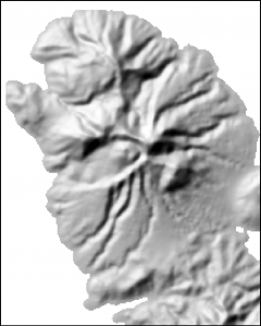
Shaded relief, or hillshade, base map. 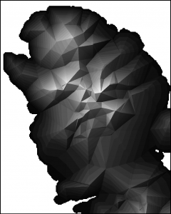
TIN base map.
Figure 2: Cartoon examples of a DEM base map, a shaded relief or hillshade base map, and TIN base map.
Digital Elevation Models (DEMs), shaded relief or hillshade maps, and Triangulated Irregular Networks (TINs) are all digital representations of topography (Figure 2).
Hillshade, or shaded relief, maps are based on DEMs but simulate shadows to emphasize terrain relief and thus mimic the look of real topography shaded by the sun. Hillshades are the most common basemap used by volcanic hazard maps in the database (44%). Studies have shown that hillshade maps are much more intuitive for topography interpretation than contour maps (Haugerud & Greenberg 1998; Konnelly 2002).
Hillshades can be created from a DEM using a GIS and specifying the azimuth and elevation of the simulated sun. Default settings typically place the sun at the upper-left corner of the map. Placement of the simulated light source at the lower-right corner of the map can make the topography appear inverted due to perceptual illusions, and should be avoided (Saraf et al. 1996; Bernabé-Poveda & Çöltekin 2014).
Examples of volcanic hazard maps using a hillshade or shaded relief basemaps include: Okmok, USA (2005); Kanlaon, Philippines (2016); and Osorno, Chile (1999).
A full list of maps using a hillshade basemap can be found here.
A few maps in the database use non-shaded DEMs. Only one example currently exists in the database of a map using a TIN (Arenal, Costa Rica 2003).
Contour or topographic map
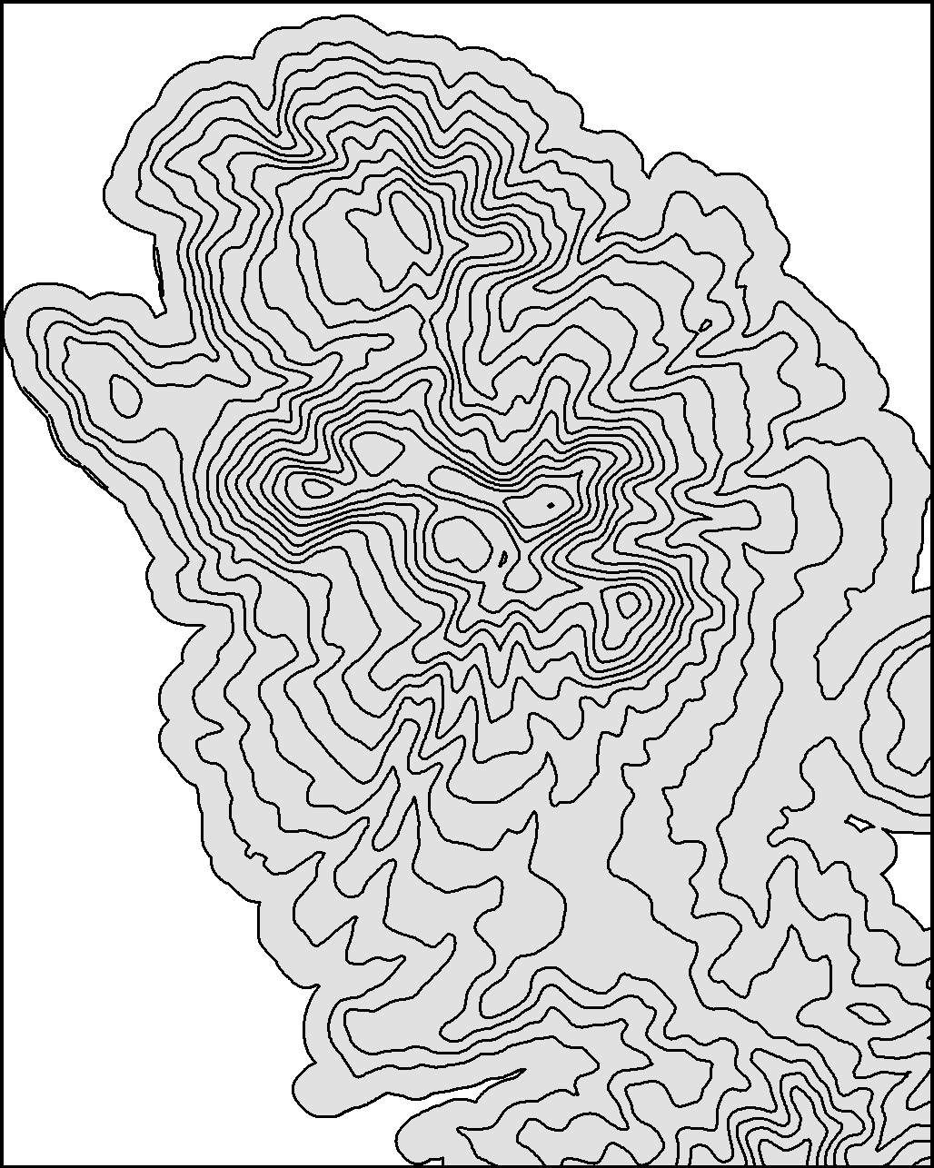
Contour maps, or topographic maps (Figure 3), are the second most common type of basemap used for volcanic hazard maps in the database (38% of maps). Contour maps are generally more common on older maps, before the advent of GIS programs that made DEMs and hillshade base maps more prevalent.
However, contour maps require specialized training to interpret and are not intuitive for the general public, and indeed pose a challenge even for geoscience students (Gobert 2005; Rapp et al. 2007; Clark et al. 2008). One study of public interpretation of contour lines on a volcanic hazard map found that respondents could not interpret topographic relief from contour maps and confused contour lines with roads and hazard zone boundaries (Haynes et al. 2007). Studies have shown that comprehension of contour lines is improved when they are overlain on hillshade maps (Eley 1986; Rapp et al. 2007; ).
Some examples of volcanic hazard maps using contour or topographic base maps include: Glacier Peak, USA (1995); Dukono, Indonesia (2008); and Mocho-Choshuenco, Chile (2006).
A full list of maps using a contour lines as the main base map or as an overlay can be found here.
Simple base maps, street maps, or trail maps
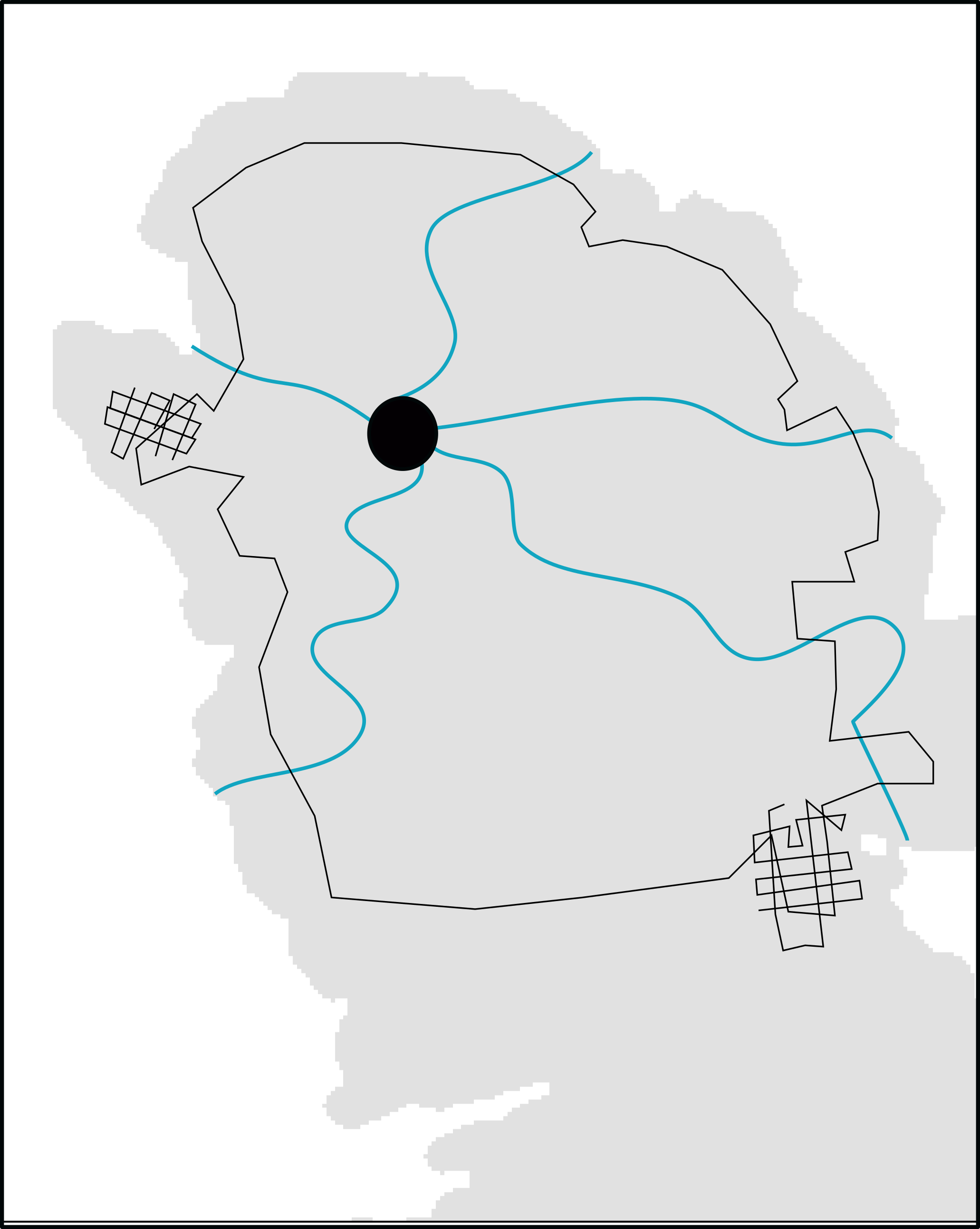
Simple basemaps (Figure 4) are common on older maps created before GIS systems were available and on regional or distal hazard maps that cannot show fine detail (18% of maps). These maps may show nothing except the outline of an island or land-use boundary, or they may have symbology portraying major roads, drainages, water features, and other landmarks. They lack topographical information, other than labeling mountain ranges, hills, or volcanoes.
Using a simple sketch map as a basemap has the advantage of visual simplicity and avoids clutter; however, simple maps may lack the detail needed for discerning the real-world locations of hazard map boundaries.
Some examples of volcanic hazard maps using a simple basemaps include: St Catherine, Grenada (2005); Augustine, USA (1998); and Chile regional map (2011).
A full list of maps in the database using a simple basemap can be found here.
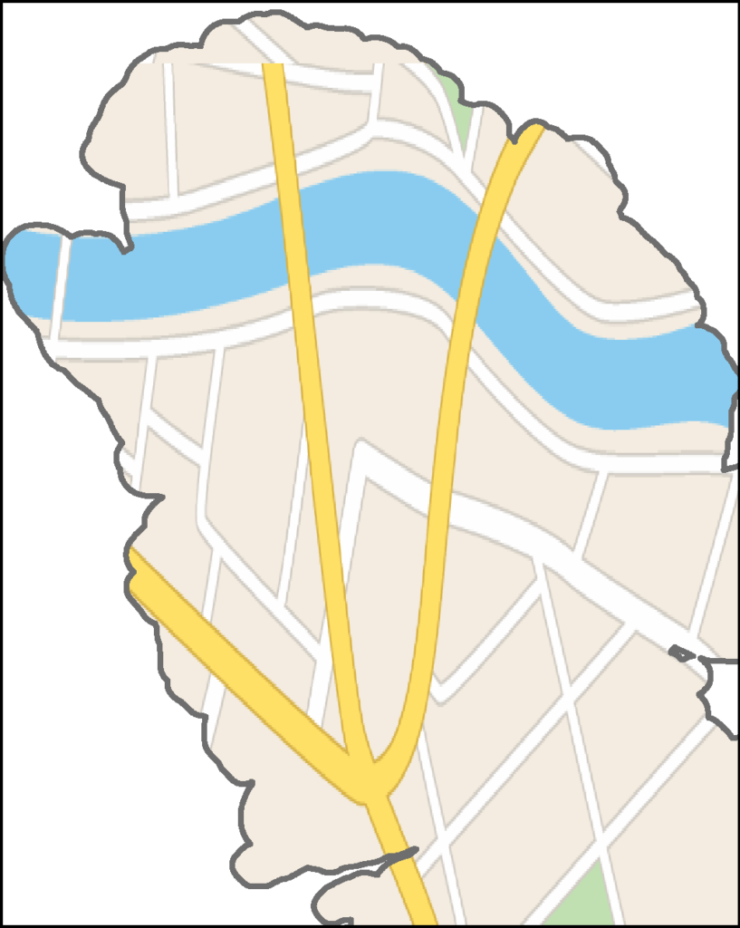
Some maps (3%) use more detailed street maps as the main basemap (Figure 5); however about 61% of maps in the database have a street map as an overlay. Street maps may include infrastructure (such as power lines and railroads), street name labels, important buildings or landmarks, bridges, and other municipal information. These maps are more detailed than simple basemaps, and have enough detail for users to locate themselves or other places of interest relative to hazard zones. They lack topographical information unless draped over another base map style.
Some examples of volcanic hazard maps using street maps include: California, USA (1989); Holuhraun, Iceland (2014); and Cayambe, Ecuador (2019).
A full list of hazard maps in the database using a street map as the basemap or as an overlay can be found here.
Some specialized hazard maps designed for popular tourist destinations use hiking trail maps as the main base map or as an overlay (12%). A full list of maps using a hiking trail map as a basemap or as an overlay can be found here.
As for all basemap types, care should be taken to avoid colors for map symbols that may be confused with hazard information. For example, in a study by Haynes et al. (2007) respondents studying a hazard map confused a red road symbol for a lava flow or other danger zone.
Satellite image or photograph
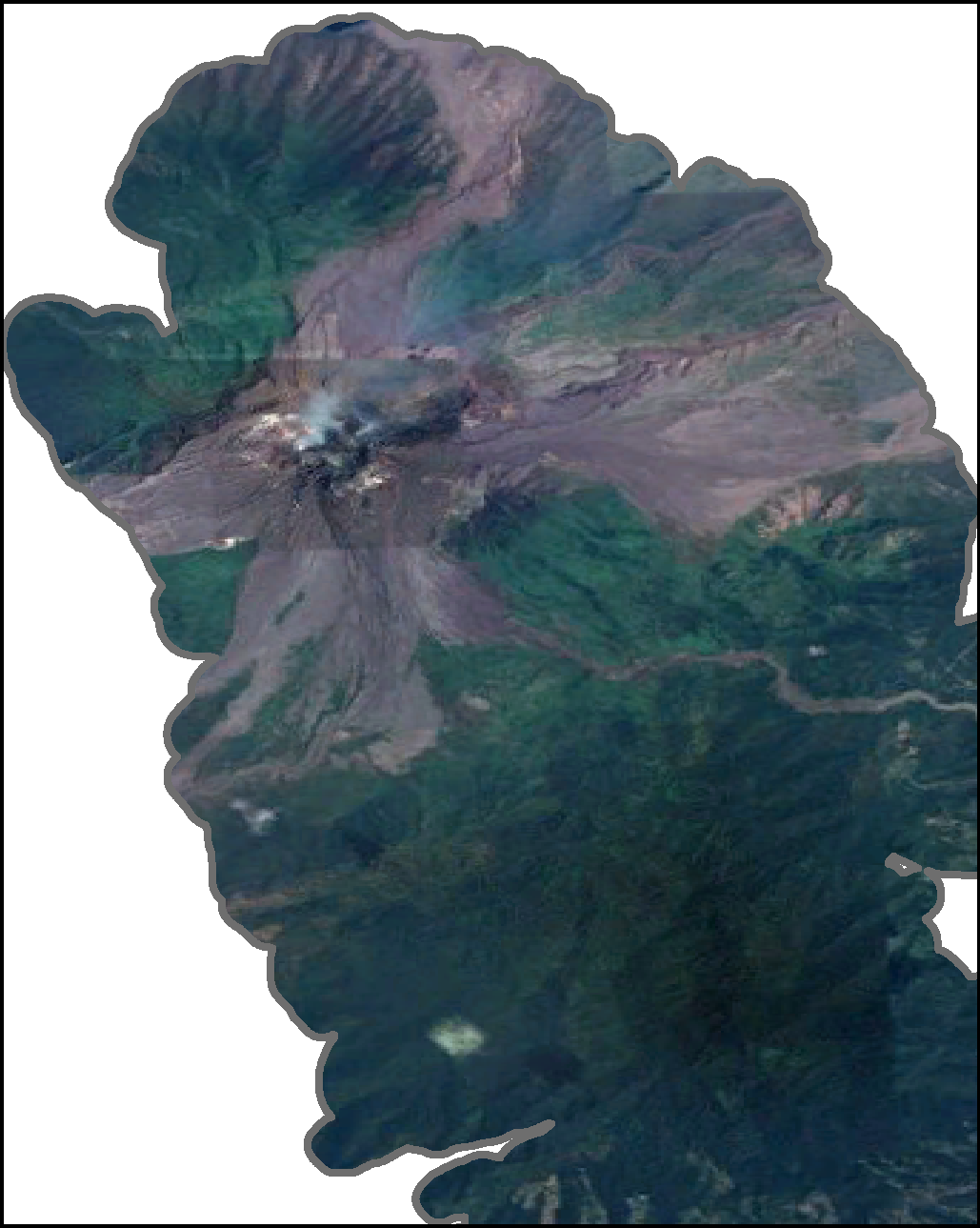
Only a small percentage of maps in the database use satellite images (4%) or photographs (1%) as basemaps (Figure 6). Research has shown that true-color satellite images or photographs are particularly easy for the general public to interpret, especially for tasks such as orienting, identifying map features, and comprehending volcanic hazard information (Haynes et al. 2007). However, it may be difficult to layer hazard zone and other information on photographs without the map becoming cluttered or obscuring the photographic base.
Some examples of volcanic hazard maps using satellite images as basemaps include: Fuego, Guatemala (2018); Auckland Volcanic Field, New Zealand (2015); and Galeras, Colombia (1997). A full list of maps using satellite images as basemaps or overlays can be found here.
Examples of volcanic hazard maps using photographic basemaps include: Ruapehu, New Zealand and Yasur, Vanuatu.
A full list of maps in the database that use photographs as basemaps or overlays can be found here.
Multiple base maps
Some maps (2%) have multiple basemap types, either because the map is composed of a series of small map panels with different basemaps or because the map is interactive and allows the user to choose a basemap over which to plot the hazard zone information. Some examples of volcanic hazard maps using multiple basemaps include: Pinatubo, Philippines; Ubinas, Peru (2019); and San Martín, Mexico (2018).
A full list of maps in the database using multiple basemaps can be found here.
Other overlay types
Many maps display other types of spatial information on the hazard map. These can include town locations (74%), infrastructure layers (24%), population information layers (1%), land-use zones (<1%), and flight paths (<1%).
Dimensionality or Map View Type
Planimetric, 2D, or map view 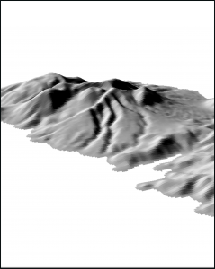
Oblique, 3D, or perspective view 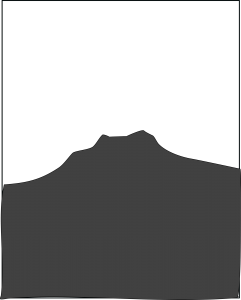
Cross-sectional view
Figure 7: Cartoon examples of planimetric (2D or map view), oblique (3D or perspective view), and cross-sectional view style maps.
While the vast majority (97%) of maps in the database are presented in a planimetric, 2D, map view (Figure 7), some maps are presented in an oblique, 3D, perspective view (2%). A handful of interactive maps allow the user to manipulate the view type (<1%). About 5 maps in the database (<1%) are presented in cross-sectional view in order to show aerial ballistic hazard zones.
Research on the effect of map dimensionality on the comprehension of hazard maps has shown that some tasks are more easily accomplished on planimetric (2D) maps while other tasks are more suited to oblique (3D) maps. Work by Haynes et al. (2007) found that members of the public were better able to interpret topography (e.g. identify hills and valleys) and understand volcanic hazard zones on 3D perspective view maps; however, it was easier for the participants to locate places and orient to compass directions on 2D planimetric maps. Because perspective view maps cannot incorporate scale bars and tend to only show one flank of a volcano at a time, they are better-suited to hazard awareness and evacuation route mapping for the general public rather than land-use planning.
A full list of maps using 2D planimetric views can be found here, and includes the majority of the maps in the database. Some of these 2D maps have insets showing an oblique view of the landscape.
Some examples of maps using 3D perspective views include: Ruapehu, New Zealand; Hood, USA (2015); and Yasur, Vanuatu.
A full list of 3D perspective maps can be found here.
Examples of maps using cross-sectional views include: Galeras, Colombia (2015); Lascar, Chile (2017); and El Chichón, Mexico (2016).
A full list of cross-sectional maps can be found here.
Some examples of maps using multiple view types include: El Misti, Peru (2019) and Reventador, Ecuador (2019).
A full list of maps with multiple view types can be found here.
Layout
Main map panel
Volcanic hazard maps also vary in the layout of the hazard information. Most maps in the database (77%) consist of just one large main map panel (Figure 8), usually with accompanying text, and sometimes with inset photos or other non-map insets.
Some examples of maps with one main map panel include: Nevado del Tolima, Colombia (2007); Antuco, Chile (2012); and Kaba, Indonesia (2008).
A full list of maps using this layout can be found here.
Main map and inset panels

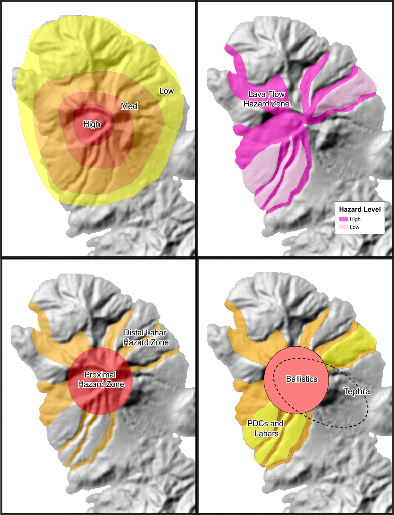
Other maps (11%) consist of a main map, with a series of insets (Figure 9), along with any accompanying text. The main map may show integrated hazard zones with individual separated hazards shown in the insets; or proximal hazards may be shown on the main map panel, with distal or regional hazards on the insets; or the most probably hazards may be shown on the main map, with less likely hazards shown on insets.
Some examples of hazard maps using this map layout include: Mentolat, Chile (2012); Akutan, USA (1998); and Sangay, Ecuador.
A full list of maps using this layout can be found here.
Series of small map panels
Some maps (12%) do not have any main map panel, but instead consist of a series of small map panels of roughly the same size (Figure 10). Often, one panel may be devoted to each separated hazard type, or to a series of different scenarios.
Examples of maps using a series of small panels include: San Miguel, El Salvador (2004); Rainier, USA (2003); and Popocatépetl, Mexico (2016).
A full list of maps using this layout type can be found here.
Cartographic Elements
A variety of cartographic and other map elements (Table 1), either visually depicted on the map or included in the map text, have been recorded in the database and many of these are search options in the advanced map search.
These include common cartographic elements such as north arrows, map scales, coordinates, legends, area maps, etc. Other map elements recorded in the database include evacuation routes; actions to take; safe zones or shelters; past deposits; eruptive history information; details and definitions of the included hazards; impact details and locations; methodology descriptions; references; additional information sources; conditional validity or expiration date; hazards from other volcanoes; hazard velocity, travel, or arrival times (whether depicted on the map or discussed in the text); and whether uncertainty is discussed or visualized in some way (buffer zones, fuzzy boundaries, shading, symbols, or versions).
| Map element | Description | % of maps |
| action | The map describes what to do during unrest or eruption | 20 |
| alert level scheme | The alert level scheme for the volcano is described | 10 |
| area map | An area map is included that shows the regional context | 22 |
| audience and/or purpose | The intended audience or purpose is described | 10 |
| cartographic legend | A legend is provided for cartographic symbols (e.g. roads, lakes) | 50 |
| color scheme order | Color scheme is in order (e.g. red = high hazard) | 57 |
| conditional validity | The conditions under which the map is valid are described (e.g. VEI < 5, central vent eruptions) | 23 |
| coordinates | Geographic coordinates are shown | 58 |
| eruptive history | The eruptive history of the volcano is described | 19 |
| evacuation route | Evacuation routes are visually depicted on the map | 9 |
| expiration | The conditions that will trigger map revision are described (e.g. summit changes, a time limit, new information) | 6 |
| glossary of terms | Geological terms are defined in a glossary section | 5 |
| hazard details | Hazard processes are defined or described | 17 |
| hazard travel time | Hazard process arrival times or velocities are depicted or described | 12 |
| hazard zone description | Hazard zones have accompanying descriptions beyond labels | 73 |
| hazard zone legend | A legend is provided for the hazard zones | 88 |
| impact details | Impact details (e.g. roof collapse, crop damage) are described | 19 |
| impact locations | Specific towns or drainages are named or listed | 15 |
| insets | Insets containing non-map information are included | 20 |
| methods | Hazard zonation methods are described in the text | 37 |
| more information source | Sources for additional information are given | 16 |
| north arrow | A north arrow is included | 65 |
| oblique image included | Oblique (3D) inset images of the terrain or hazard zones are shown | 4 |
| other volcanos | Hazard zones from nearby volcanos are also shown on the map | 2 |
| past deposits | Deposits from previous eruptions are shown visually | 15 |
| person hours | The amount of time required to make the map is stated | 1 |
| photos | Photos of the volcano, deposits, impacts, etc. are shown | 12 |
| population information | Population information (e.g. numbers of inhabitants in towns or hazard zones) is depicted or described | 8 |
| references | Reference literature is cited | 16 |
| safe areas | Safe areas, including shelters or muster points, are depicted | 12 |
| scale bar | A scale bar is included | 85 |
| version number | Version numbers or a revision history is provided | 10 |
| wind rose diagram | A wind rose diagram of either wind directions or tephra dispersal directions is provided | 1 |